DEPARTMENT OF MASS COMMUNICATION,
BAYERO UNIVERSITY, KANO
2013/2014 NEWSPAPER EDITING, LAYOUT AND DESIGN
LECTURE
NOTE 2
TYPES OF LAYOUT
Regardless of
which category-Layout can be further divided into either modular or
rectangular.
Ø Modular
Layout: This type of layout is designed in such a way that the page is break
into a series of rectangles- Headlines and related texts will form a four sided
rectangular units. Each story is made to fit into a rectangular module and each
story is separated by a white space.
Ø Irregular
layout on the other hand breaks a page into a series of inter-locking
shapes-(Jigsaw)
It
should be noted that, the layout type can change but the format remains the
same.
LAYOUT FORMULAE
- VERTICAL LAYOUT:
This is the simplest form of page organization. Using these formulae
headlines are the width of the basic single column grid and the text run a
single column. It is the oldest form of layout and it is extremely limited
in the range of news values it can express, visually depressing but the
vertical shapes suggest energy C is appropriate for news. It gives maximum
number of stories above fold. The issue of visual depression can be
overcome by using colors along the horizontal lines (black & white) or
varying adjacent heads. It can also overcome by the width of column
inches. This could be used to overcome the problem of news values.

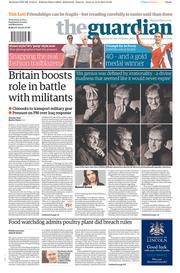
Follow
this URL for more example http://www.thepaperboy.com/frontpages/archive/The_Guardian_13_8_2014.jpg
- HORIZONTAL LAYOUT:
Is a form of page organization that has more capacity for emphasis. A
study fully designed horizontal layout is modular in shape with text
squared up under a multi-columns h/L to create several horizontal units.
The shape is therefore made up of series of these horizontal units lying
on the top of each other.


The
horizontal layout has the following merits:
- It makes long stories to appear shorter
- A complete news story can be read with the
page folded at natural.
- Headlines are separated from each other by
texts, thereby enabling h/L to retain its emphasis.
- It makes full use of the width of the page.
On the other side:
- It
yields few stories above the fold & often only those stories above the
fold on a page are visible at retails or sales outlets.
- It
suggests rest & repose: A page designed based on series of horizontal
lines may seem as monotonous as a prairie
- QUADRANT/DIAGONAL:
The quadrant layout divides the page into units or sections using a line
at fold and another down the middle of the page. Each of the four sections
will be assigned with attention compeller. This formula reminds the editor
that there is more to a page than the top.

DEMERITS:
- Geometric
rigidity: The danger of the inflation values. Another type of Quadrant is
Diagonal in which the layout editor places.
- H/L
along the imaginary diagonal lines that divide the page across the second
variant of the quadrant has the virtue of reminding the layout man that
H/L can be distributed everywhere on a page.
- FRAME LAYOUT:
Is more of gimmick than a formula. It offers very little guidance on
emphasis or organization. It is designed based on simple fact that on an
eight column page. Column 1 and column 8 should be of solid text so that
beneath the paper’s title and eight column banner head, the rest of the
content will form a frame.


|


- BRACE LAYOUT:
Using layout formulae, the headlines are arranged in steps so that the one
at the top of the page is supported by another running parallel. In other
words; it’s design with overwhelming large headlines which dominates the
entire page with minor headlines beneath as supporters. It is also called
(known as focus). The related stories will run parallel to the upper
headlines which were arranged in steps.

This
layout formula has two disadvantages:
- Each headline can lose its emphasis as they
may be competing for attention and depriving each other of contrast
- The brace layout forces the texts away from
its related headline.
- CIRCUS LAYOUT
FORMULA: All that the layout editor needs
to consider when using this layout formulae is that the page is arranged
in such a way that everything seems to happen at once. Several headlines,
not necessarily of the same size are carelessly used on the page. Each
headline will have to fight for attention. Usually, this form of layout is
appropriate when the stories are short. The headline on this kind of page
are dramatically displayed to entertain as well as to inform the readers.


- SYMMETRICAL
LAYOUT: The name symmetrical was viewed
from the word symmetry which means two sides with equal things. In
newspaper term ‘Symmetrical Layout’ is the kind of layout that attempt to
produce a page of equal balance and weight around its axis-optical center
of the page. Each side of the optical center is a mirror reflection of the
other. The h/lines on the others sides are of the same weight and form
with those on the other sides. The run of the text also are the same on
both sides. It should be noted that, the optical center of the page is not
the mathematical center as a horizontal unit-rather the optical centre of
a symmetrical page is the mathematical center of the page as a vertical
unit. To achieve this form of layout, the layout editor places the optical
center of the mass on the optical center of the unit and is only possible
when you have only one mass or design such as h/L on a feature page.


ADVANTAGES
- Offers the designer the chance to clear
organization
- It has a powerful appeal for serious papers
- Satisfy the mind of natural demand for balance
DISADVANTAGES
a. It distorts news values
b. Very difficult to achieve
c. It is considered outdated
8. ASYMMETRICAL LAYOUT FORMULA
asymmetrical layout formula
is typically off-center or created with an odd or mismatched number of
disparate elements. When the left and right sides of the design are unequal it
is said to have asymmetrical balance.
Asymmetrical
does not necessarily mean unbalanced.
A print document may also be asymmetrical in other ways. A
folded piece with distinctly uneven panels has asymmetrical folds, such as the shape
of a package where the left and right or top and bottom are not mirror images
is asymmetrical.


thank you sir
ReplyDeleteThis comment has been removed by the author.
ReplyDeleteSir, what are the functions of layout?
ReplyDeleteawsm!
ReplyDeletethank you yaar
ReplyDeleteItz valuable
ReplyDeleteThis was beautifully summed up. Thank you so much!
ReplyDeleteWhat is sports page make up, edit-page make up, life style make up, feature page make up, Sunday magazines page make up ?
ReplyDeleteThank you, my students in Journalism find the article helpful!
ReplyDeleteThank you sir
ReplyDeleteThis would be very helpful for my exam today, thanks for sharing
ReplyDeleteThank u sir
ReplyDeleteTank u.
ReplyDelete